In a warm neutral interior, the door is never just a pass-through element. It becomes part of the room’s visual field, shaping how light, texture, and proportion are experienced from one space to the next. If you have ever wondered how to match interior door finishes to warm neutral interiors without making the architecture feel flat, the answer usually lies in restraint, material harmony, and the right kind of contrast.
Beige, taupe, cream, sand, travertine, oak, walnut, and brushed metals can create a rich palette, but only when the finishes are coordinated with intention. The goal is not for the door to disappear entirely. It is to make the door feel integrated, calm, and purposeful within the broader interior composition.
Why door finish choices matter in warm neutral spaces
Warm neutral interiors rely on subtle shifts in tone and texture rather than strong color contrast. That makes the door finish especially important because it can either strengthen the room’s architecture or interrupt it. A door that is too cool, too glossy, or too visually loud can separate itself from the wall and furniture scheme in a way that feels accidental.
In a well-composed interior, the door finish should support the overall rhythm of the space. It might echo the grain of oak flooring, soften the edge of a stone wall, or introduce a controlled accent through bronze hardware. The key is to think of the door as a design surface, not simply a functional panel.
Start with undertone, not just color
Warm neutrals are rarely one-note. A room may lean creamy, mushroom, sandy, caramel, or parchment, and those undertones affect how a door finish reads in daylight and artificial light. A pale painted door can look refined against a warm wall if both share a similar softness. A walnut veneer can feel grounded in a palette that includes travertine, linen, and bronze accents. By contrast, a cooler gray or blue-leaning finish can look disconnected, even if it is technically neutral.
Consider sheen as carefully as hue
Sheen changes the architectural presence of the door. High-gloss finishes can add polish, but in warm minimal interiors they often introduce a level of reflection that competes with stone, wood, and textured plaster. Matte and satin finishes usually feel more aligned with contemporary luxury interiors because they absorb light gently and support a quieter visual rhythm.
The finish families that work best with warm neutrals
There is no single correct answer, but a few finish families tend to work especially well in warm neutral settings. The best choice depends on whether you want the door to blend in, subtly contrast, or establish a stronger architectural statement.
Painted flush doors for soft continuity
Painted flush doors are often the most seamless option when the wall palette is calm and architectural. A door finished in a soft ivory, warm white, or muted greige can blend into the envelope of the room, especially when paired with concealed or minimal hardware. This approach works well in hallways, bedrooms, and home offices where visual continuity matters.
For readers comparing different configurations, the door catalog is a useful place to study how finish, proportion, and form work together across contemporary interiors.
Wood veneer for depth and warmth
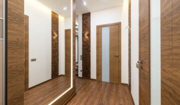
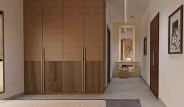
Wood veneer brings a tactile richness that suits interiors built around natural materials. Oak offers a lighter, more open feeling, while walnut adds depth and a more tailored contrast. In either case, the grain should feel deliberate rather than overly busy. A door with a restrained veneer pattern can reinforce the room’s material rhythm without dominating it.
In luxury interiors, veneer often works best when it is coordinated with floors, cabinetry, or wall paneling so the composition feels layered rather than repetitive. When the same wood appears everywhere, the space can lose definition. When the wood is balanced with stone, paint, and textile softness, the result feels more architectural.
Lacquer and matte finishes for a refined modern edge
Matte lacquer can be an excellent choice when the design calls for a more precise, edited look. It creates a smooth surface that sits comfortably beside plaster walls, linen upholstery, and bronze details. A slightly warmer lacquer tone can unify the room without becoming visually heavy. This is especially effective in apartments and penthouses where clean lines and understated surfaces are part of the design language.
For more editorial coverage of modern door design and interior architecture, see more design inspiration.
How hardware changes the final reading
Hardware often determines whether a door feels integrated or detached. In warm neutral interiors, brushed bronze, muted brass, and darkened metal tones usually complement the palette better than bright chrome or stark black, though the right choice still depends on the architecture. The goal is not to make hardware invisible. It is to make it feel proportionate to the rest of the composition.
Match the visual weight, not every finish
A common mistake is trying to match every surface too literally. The door does not need to copy the floor, the walls, or the cabinetry. Instead, it should share a similar level of visual weight. For example, a walnut door with bronze hardware can feel balanced beside travertine and cream upholstery because the finishes speak the same material language, even though they are not identical.
Use contrast sparingly
If the interior is already rich with texture, a door finish that introduces too much contrast can break the calm. On the other hand, a completely tone-on-tone approach may flatten the room. The most successful interiors usually include one or two deliberate contrasts: perhaps a darker door against pale walls, or a softly colored door within a wood-forward palette. That contrast gives the architecture clarity.
Think in terms of transitions, not isolated rooms
One of the strongest ways to design around warm neutral interiors is to think about how the door performs across an entire sequence of spaces. A bedroom door should relate to the hallway. A powder room door should not feel disconnected from the adjacent living area. A home office door should support privacy without visually interrupting the rest of the home.
This is where architectural integration becomes more important than decoration. If the door is flush, aligned, or concealed within the wall plane, it contributes to a quiet sense of order. If it becomes a visual accent, it should do so intentionally and with enough material confidence to belong in the broader scheme. For projects where this level of integration matters, DAYORIS custom interior door applications can offer a relevant point of reference for contemporary door planning within a larger interior concept.
If you are selecting finishes for a new build or renovation, begin with the room’s dominant materials, then study how the door will look in both daylight and evening light. The most successful choice is usually the one that feels calm at first glance and even better over time. In warm neutral interiors, that quiet confidence is what makes the architecture feel resolved.
For a tailored conversation about selecting a finish family that suits your interior direction, contact the team and continue shaping the details with the same care as the rest of the space.