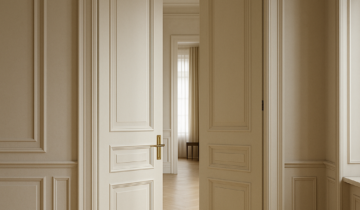
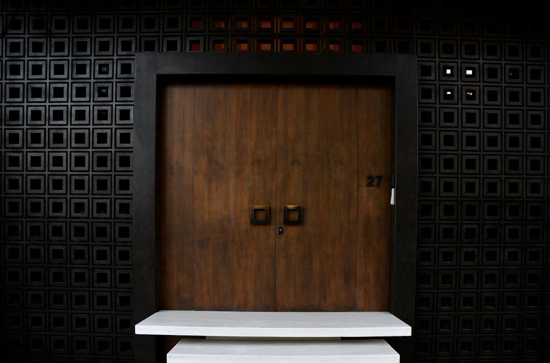
When a room already has textured walls—limewash, plaster, wood slats, fluted panels, stone, or woven wallcoverings—the door becomes more than a passage. It is part of the room’s visual rhythm. Knowing how to match interior doors with textured walls is really about deciding whether the door should disappear into the architecture, echo the wall treatment, or offer a restrained counterpoint. In luxury interiors, the best answer is rarely loud. It is usually disciplined, proportionate, and intentional.
Why texture changes the role of the door
Smooth drywall and a simple painted door are easy to coordinate because there is little visual competition. Add texture, however, and the wall begins to carry light differently throughout the day. Shadows, seams, and surface variation can make a standard door frame feel visually busy. That is why the door’s profile, finish, and detailing matter so much. A well-chosen door can extend the room’s calm; a poorly considered one can interrupt it.
The first question is not what door style is most fashionable, but what the wall is already doing. If the wall is highly tactile, the door should usually stay quieter. If the wall treatment is subtle, the door can take on a slightly stronger architectural presence without upsetting the composition.
Choose between contrast and continuity
There are two reliable approaches when matching doors to textured walls: continuity and contrast. Continuity creates a near-monochrome effect, where the door finish is close to the wall tone and the frame lines are minimized. Contrast uses a distinct material or color so the door reads as an intentional architectural object. Both can work beautifully, but each serves a different purpose.
When continuity is the better choice
Continuity is ideal when the goal is visual calm. A flush door in a similar tone to limewash, plaster, or oak paneling lets the wall remain the dominant surface. This approach is especially effective in hallways, primary bedrooms, and open-plan spaces where too many visual breaks would fragment the architecture. Concealed frames, reduced trim, and understated hardware help the door sit naturally within the composition.
When contrast creates stronger architecture
Contrast is useful when the wall texture is soft or tonal rather than dramatic. A walnut door against pale plaster, for example, can add depth and warmth without feeling heavy. A lacquered door in a muted matte finish can also sharpen the geometry of a textured wall. The key is restraint: contrast should clarify the architecture, not create a visual argument.
Material and finish choices matter as much as color
Texture is not only about appearance. It changes how light lands on a surface, which means finish selection becomes critical. Glossy doors reflect light and can feel out of place next to a soft, tactile wall. Satin, matte, oiled wood, and low-sheen lacquer finishes usually feel more cohesive because they absorb light more gently.
Wood species and veneer direction also matter. A vertical grain can reinforce tall wall treatments and floor-to-ceiling proportions. A horizontal grain may feel more relaxed in long corridors or lower-ceilinged rooms. If the wall texture is already directional, such as slatted wood or ribbed panels, a simpler door surface often provides the right balance.
Proportion and shadow lines are part of the design language
With textured walls, proportion becomes even more visible. A narrow door in a highly patterned wall can look timid, while an oversized door with crisp lines can help anchor the room. The relationship between door height, wall rhythm, and surrounding trim should feel deliberate. Even small decisions, such as how the frame aligns with panel joints or how much shadow gap is left around the leaf, influence the overall reading of the space.
For readers exploring contemporary formats, the catalog of luxury interior doors is a useful way to study how different profiles, finishes, and proportions change the visual weight of a room.
Hardware should support the wall, not compete with it
On textured walls, hardware should usually stay quiet. Long linear handles, concealed hinges, and minimal escutcheons are often better than ornate hardware because they preserve the architectural logic of the surface. If the room already includes strong texture, keep the hardware in a finish that belongs to the palette rather than introducing another visual accent.
Bronze, blackened metal, brushed nickel, and soft champagne finishes can all work, but the deciding factor is not trend. It is whether the hardware recedes or interrupts. In many refined interiors, the best choice is the one you notice only after you have taken in the room as a whole.
Room-by-room applications
In bedrooms, a quiet door helps textured walls remain calming rather than busy. In living spaces, a more expressive door finish can echo cabinetry, shelving, or millwork and strengthen continuity. In corridors, where texture often spans long surfaces, flush doors can prevent the space from feeling overdesigned. In bathrooms and dressing rooms, where privacy and material richness often meet, subtle contrast can add depth without overwhelming the room.
If the project calls for a highly integrated approach, DAYORIS architectural door solutions offer a relevant reference point for understanding how a door can participate in the wall composition rather than sit apart from it.
Common mistakes to avoid
The most common mistake is treating the door as an afterthought. A second mistake is choosing a finish that is too shiny for a textured setting. Highly reflective surfaces can fight with plaster, stone, and timber grain. Another frequent error is overcomplicating the frame with decorative moldings or oversized profiles, which can make a carefully textured wall feel visually crowded.
It is also worth avoiding