In warm minimalist interiors, the question is not simply whether interior doors should match wall color. It is how the door participates in the room’s visual rhythm. A well-resolved door finish can either disappear into the architecture or introduce a quiet layer of contrast that gives the space more depth. For homeowners, architects, and designers working with warm minimalism, that decision affects proportion, light, and the sense of continuity from one room to the next.
If you are trying to decide between a seamless look and a more expressive finish, the best answer depends on the architecture around the door. Wall texture, natural light, trim profile, ceiling height, and the material palette all influence whether the door should recede or stand out. In many refined interiors, the most successful result is not a perfect visual match, but a thoughtful tonal relationship.
When Matching the Wall Color Creates the Strongest Effect
Matching interior doors to the wall color works especially well when the goal is calm, uninterrupted surfaces. In hallways, compact rooms, and open-plan spaces with strong architectural lines, a door painted the same tone as the walls can reduce visual noise and make the envelope feel more unified. This approach is particularly effective in warm minimalist interiors where plaster, limewash, or matte paint already create a soft, layered backdrop.
A matching door can also be useful when the architecture includes multiple door openings close together. Instead of breaking up the wall repeatedly, a coordinated finish helps the room read as a single composition. That can make a space feel more generous, especially when the doors are flush, concealed, or paired with minimal casing.
Choose tonal alignment, not forced exactness
On site, walls and doors rarely absorb light in the same way. A wall with a matte mineral finish may appear slightly different from a painted wood door even when the color formula is close. That is not a flaw. In fact, subtle variation often adds richness. The goal is tonal harmony, where the door belongs to the wall plane without looking pasted on.
When Contrast Is the Better Architectural Choice
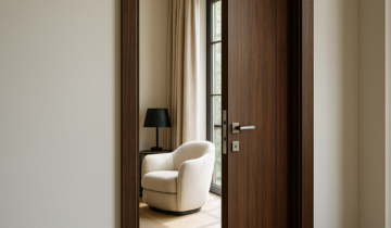
Contrast becomes valuable when the door is meant to define a transition. In homes that use pale walls, a walnut door or a dark lacquered panel can create a deliberate point of focus. This is often effective at the entry to a primary suite, a home office, or a library, where a shift in material can signal a shift in use and mood.
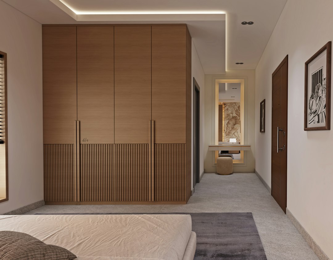
Contrast can also help organize circulation. In a long corridor, for example, a darker door may punctuate the wall rhythm and make the sequence of openings easier to read. Used carefully, that contrast feels architectural rather than decorative. It gives the eye a pause without interrupting the overall calm.
Warm minimalism benefits from restrained contrast
The strongest interiors usually avoid hard opposition. Instead of pairing bright white walls with a stark black door, consider richer, softer relationships: mushroom with oak, sand with bronze, clay with smoke, or ivory with natural walnut. These combinations preserve warmth while still allowing each surface to retain identity.
Why Finish Matters as Much as Color
Color is only part of the equation. Finish affects how the door behaves in changing light. A matte or ultra-matte surface tends to blend more quietly into the architecture, while a satin finish can catch daylight and make the door slightly more legible. Veneer, lacquer, and painted finishes each produce a different visual temperature, even before color is considered.
In warm minimalist interiors, texture often matters more than saturation. A painted door may be the right choice for a calm, monolithic wall plane. A walnut veneer door may be more successful when the room needs tactile depth and a stronger connection to other natural materials. The key is to let one material lead and allow the others to support it.
Room-by-Room Guidance for a More Confident Decision
Different rooms call for different levels of emphasis. Bedrooms often benefit from quieter doors that help preserve rest and softness. Bathrooms may need a more deliberate relationship between the door, wall finish, and adjoining millwork so the transition feels intentional. Home offices, by contrast, can use a slightly stronger contrast to create a subtle threshold between work and living.
- Bedrooms: Often better with tonal continuity for a relaxed, enclosed feel.
- Bathrooms: Benefit from clean visual alignment and carefully coordinated hardware.
- Closets and utility rooms: Often work best when doors recede into the wall.
- Studios or offices: Can use contrast to mark function and improve orientation.
If your project includes multiple adjoining spaces, consistency does not always mean sameness. A private suite may use one finish family, while public areas use another. What matters is that the transitions feel deliberate, not accidental.
How to Coordinate Trim, Hardware, and Door Proportions
The most refined door choices are rarely made by color alone. Trim profile, casing depth, handle finish, and door proportion all affect whether the result feels cohesive. A matching wall color can look incomplete if the trim is too heavy or the hardware is visually disconnected. Likewise, a contrasting door can feel elegant when the surrounding details are disciplined and quiet.
For projects where the design goal is a cleaner architectural field, consider systems that prioritize visual continuity and restrained detailing. Contemporary door platforms from DAYORIS architectural door solutions are a useful reference point when studying how doors can align with wall planes, millwork, and interior transitions without overpowering the room.
It is also worth browsing the Luxury Interior Doors catalog to compare profiles and finishes, or exploring more editorial ideas on the Luxury Interior Doors blog if you are still refining the overall design language of the home.
If you are unsure whether your doors should disappear or stand out, start with the room’s main architectural intention. Should the wall read as one continuous surface, or should the door become a subtle marker of movement? In warm minimalist interiors, the most successful answer is usually the one that makes the architecture feel calm, legible, and intentional from the first glance to the last.